
The equation is a simple one: bigger groups equals more of a chance of infection.
With the help of simple data sets, Neil Carlson, Director of Calvin University’s Center for Social Research, is making it easy to visualize. His new interactive risk calculator can determine – based on real time information – how likely it is a person in a given group is infected.
"First I'm going to say for the love of God and your neighbor, please don't use anything I'm saying to rationalize risky behavior,” said Carlson about the chart. “The whole point of this conversation is to show the mathematics of what lead to shutting everything down."
And Carlson says the numbers show that the larger a group, the higher probability it contains someone who is infected with Covid-19.
"I think the thing that’s worth unpacking for just a minute is how this gets calculated to help people understand why we're shutting everything down,” said Carlson. “So hopefully if you need to convince someone that having a meeting is a bad idea…even though the numbers might seem small to you, this tool might help.”
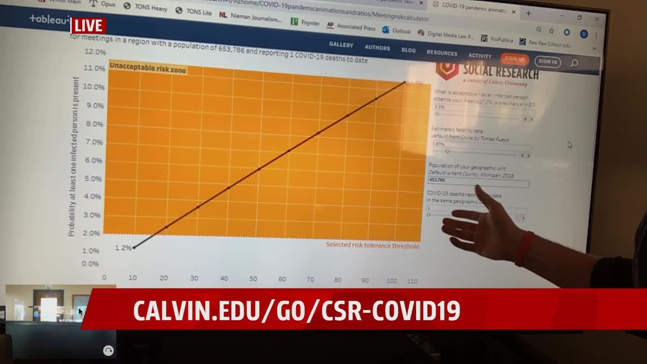
The risk calculator is part of a larger data collective from Calvin’s Center for Social Research. Carlson got the idea after reading a widely-circulated blog post, and essentially visualized the findings.
How to use the chart:
When you open the chart, you’ll see along the y-axis (vertical) the percentage that a person in a given group is infected. Along the x-axis (vertical) is the actual number of people in a given group.
Using data from the John’s Hopkins coronavirus tracking map, Carlson set the population at 653,786 – the population of Kent County where Calvin University is located, and one death, which is the real-time number of deaths in the county.
Because the infection and death rates are proportionate, Carlson estimates that in a group of 100 people in Kent County, the chances the group contains someone who is infected is 11.5%.
“Later, if there are five deaths in the county, that same meeting of 100 people has a 45% chance—nearly ‘a flip of the coin’—of someone infectious being in that room,” says Carlson.
As the death number – and thus the infection rate tied to it – increases, so too do the chances a group will contain an infected person.
“The reality is there are two different types of exponential math happening here,” said Carlson. “One is that the infection rate without controls tends to double every single day. So you get more and more people that have the bug. The fatality rate is enough to make it economically and medically significant. Because it’s going to hit the hospitals hard. Then you have this much larger exponential relationship where the much larger your meeting is, the greater the probability that someone in to room is spreading that bug and making the exponential thing much bigger.”
To find the entire data set produced by Calvin’s Center for Social Research, click here .
